Examining the overall layouts of each website is crucial in navigating and ordering the specific model that will best suit your needs. After visiting so many online stores of cabinet purveyors, we thought it prudent to provide an article that gives our audience a comprehensive guide to finding your way through these websites. This will be one of our shorter articles, but still a very important one as the websites do provide an insight into the quality of the products. So without further ado, let’s take a look at which among the websites of the RTA Store, RTA Cabinet Store, Kitchen Cabinet Kings, and Best Online Cabinets have the top-notch online cabinet retail store. And just for good measure, we’ll add Cabinets To Go into the comparison as well although we only ordered one unit from them.
Table of Contents
Website Aesthetic
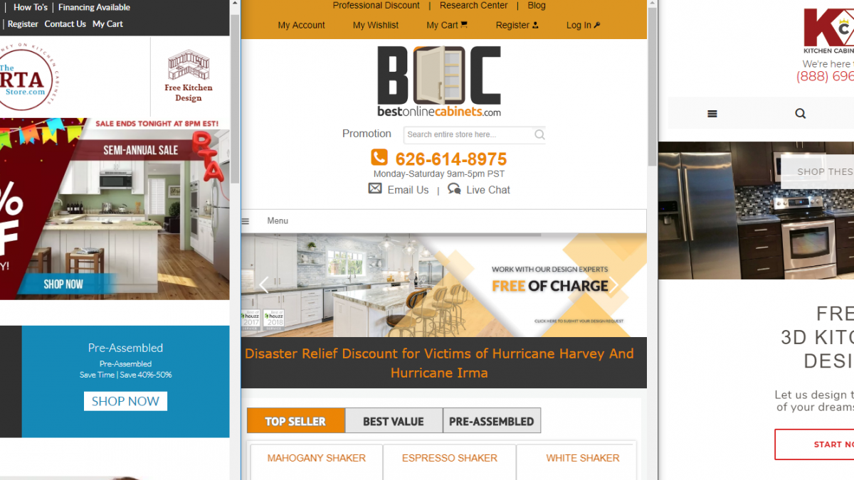
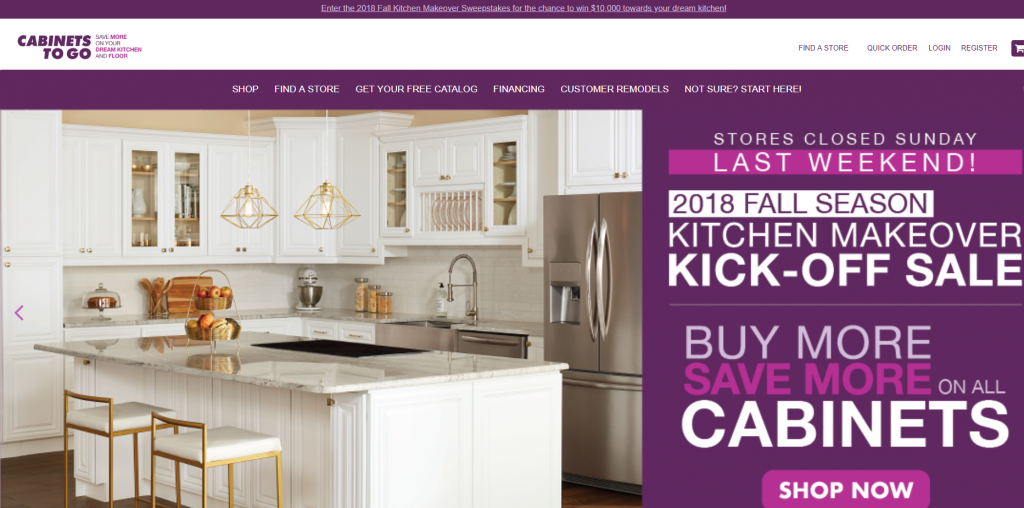
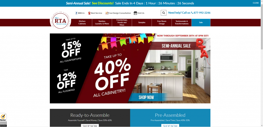
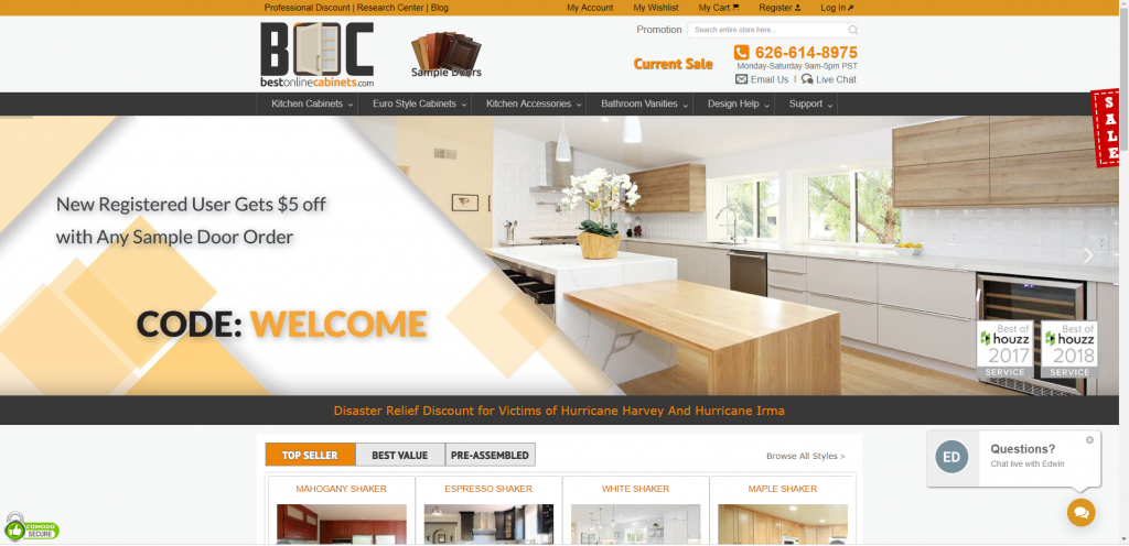
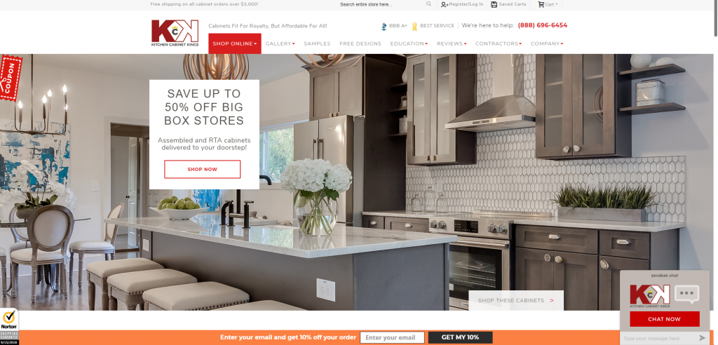
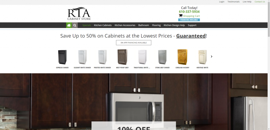
The initial impression one receives upon first visiting a website sets a precedent for how a possible consumer will interpret the product being sold on a said website. Now, this is not to say that a purveyor’s website is an accurate representation or depiction of the quality of the product offered, but the picture quality, color schemes, font of the text, and organization of information on the main landing page will guide you through the website or potentially frustrate a customer to the point where he or she turns to another distributor. All five of the websites in this comparison have straightforward main landing pages, but the websites with the best aesthetic would be The RTA Store and Cabinets To Go. This is for several reasons, but the main of which is that there is not an immediate overload of information you are hit with when first landing on the page. Kitchen Cabinet Kings and Best Online Cabinets have large pictures immediately covering the majority of the screen and require so inspection, with both feeling overwhelming upon initial visit. In comparison, the RTA Cabinet Store feels thin and bare, requiring some deeper investigation to find exactly where any deals are being offered as well as how exactly to work through the website.
As can be seen in the two pictures above, both websites of the RTA Store and Cabinets To Go exhibit qualities we previously mentioned constitute an aesthetically relieving domain. Both are designed to inform and guide rather than advertise and overwhelm with images and text. Take for example the layout of the RTA Store’s main landing page: there is color enough to attract the eye without being too busy, and three large numbers advertising current deals being offered for products. Rather than feeling assaulted by these numbers, the customer is intrigued and more likely to spend time scrolling through the deals until finding his or her way to the product they initially visited the site to examine. The simple layout and concise, contained information lends itself to be easily absorbed by the audience and also gives a sense of freedom that the other websites main pages don’t offer, which can be seen below.
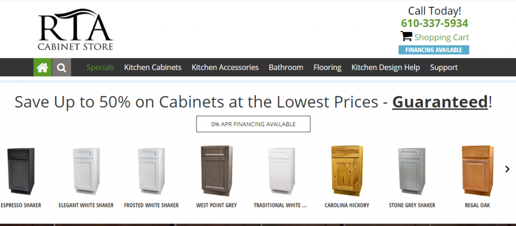
From picture quality to text font, what may seem like inconsequential characteristics of a website truly do all work together to either compel or detract potential customers from remaining on a website and looking through the cabinets offered. While everybody has their wn preferences as far as what is aesthetically appealing to them when it comes to website design, the key components we were looking for were met best by the RTA Store. Were it not for the poor picture quality and lack of any real information to hold onto and jump off from, RTA Cabinet Store’s website (directly above) would make a close second given the easy navigability, which leads us to our next section…
Navigability
Just as the website’s aesthetic determines whether or not a potential buyer will remain on the website long enough to explore, the navigability determines how easily he or she will be able to actually find the cabinet or unit they seek. Nothing is more frustrating than feeling lost on a website and having no means of asking for guidance to a section for a specific style or model. Imagine walking through a home depot in search of a quarter-inch brass wood screw and there is no employee visible to assist in your search, to point you in the right direction. That is why navigability is so essential in this comparison, and again it is the RTA Store’S website which we see as having the most accessible navigability. But before we go into what makes their website stand out, let’s highlight a few elements of the other websites that might cause some frustration.
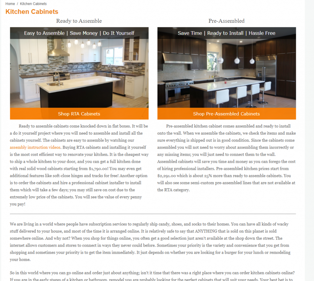
Best Online Cabinets does a splendid job of providing an abundance of information for the customers who visit their website. So much so that it can be pretty intimidating to scroll through the different pages of their website. Once you click off their main landing page and visit the “Kitchen cabinets” section of their website, you are led to a page with a lengthy description of the differences between Ready-to-
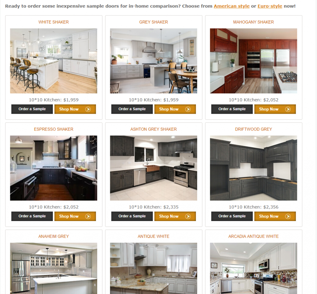
Assemble cabinets and Pre-Assembled Cabinets. This is unquestionably useful information and goes above and beyond what other websites provide: they descriptions are easy to read and understand, working wonderfully as educational pieces for the individual not as well-versed in the intricacies of modern cabinet design as most contractors. So for an individual with plenty of time on his or her hands, this information is indelible and will assist in the shopping and design process immensely. If you are a customer who knows what he or she is after, however, wading through this information proves to be an exercise in frustration. With so much text to sift through, getting to the desired location of a page containing all the styles and variations of different cabinet lines can take longer than what certain shoppers will care to spend searching. Once the page displaying the different cabinet models is located, the navigability eases up and the search becomes quite a bit easier.
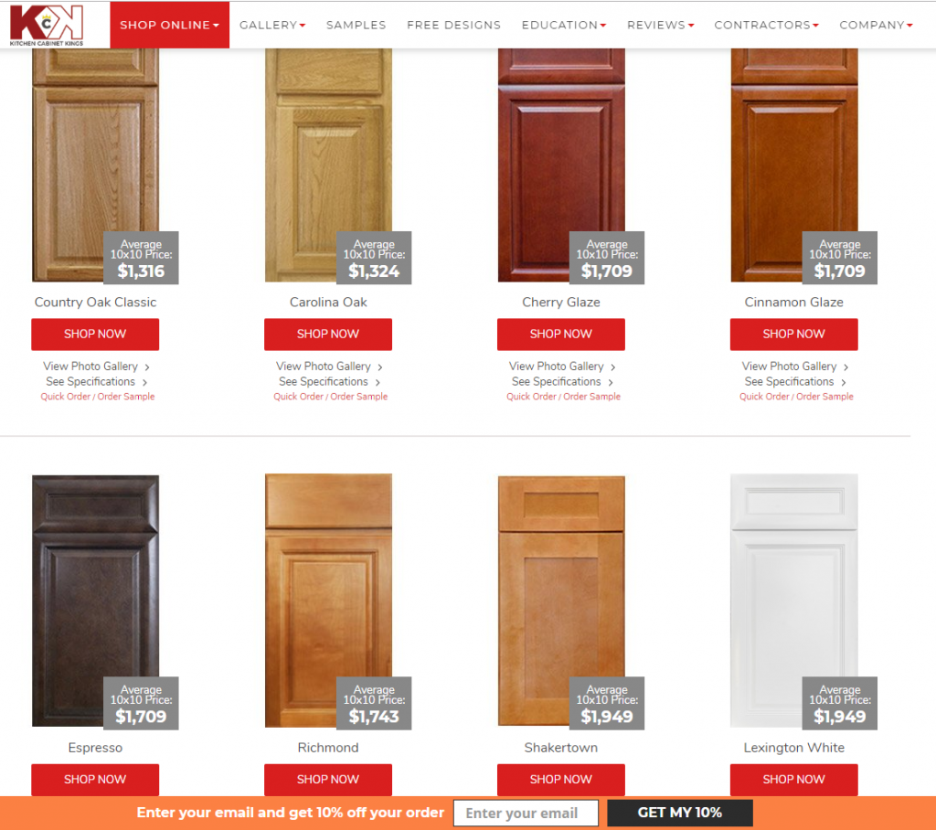
Kitchen Cabinet Kings offers a similar selection between RTA and Pre-Assembled cabinets, but their descriptions of the differences between the two are kept to simple one-sentence structures. This website is undoubtedly clean, professional, and designed to appeal to individuals looking for a more modern company to assist in their kitchen build or remodel. But, it does present some challenges concerning navigability. For example, upon clicking on withe RTA tab link or the Pre-Assembled link, we are led to an extensive page displaying every color, model, cut, and price in that category with no option to narrow the search to only “White Shaker” or “Cherryville” but instead to scroll through the list until the model appears. By comparison, Best Online cabinets exhibit a plethora of options to narrow the search and display only the model or line one is seeking, making price comparisons immensely easier as well as comparing the aesthetic of the cabinet according to pictures.
RTA Cabinet Store offers a website that is easy enough to move throughout, with the options for various cabinet lines being immediately visible on the main landing page. The options to choose between what can only be assumed to be their most popular cabinet lines (Espresso Shaker, Elegant White, Frosted White, West Point Grey, Traditional White, Carolina Hickory, Stone Grey, and Regal Oak) are made readily available at the top of this main landing page. This alleviates the stress of sifting through the website and scrolling through extensive pages of cabinet varieties, it also limits the options of the consumer and possibly derails his or her decision for what could be the right cabinet line for their kitchen needs. Further options are available to be seen by clicking on an arrow pointing to the right, with various options for drop-down menus ranging from Kitchen Cabinets to Flooring to Design Suggestions available at the top of the landing page. The effect is seamless and simple, ranking right alongside the RTA Store with the easiest website to navigate through and shop for the appropriate unit. The only downside is the slightly crude aesthetic, with large, low-quality photographs of dark cabinets dominating the screen and affecting the overall organization of the landing page.
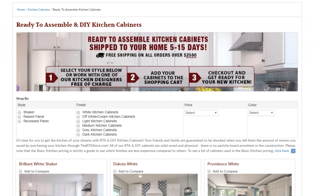
The RTA Store’s easy navigability of their inventory available on their website is thanks in large part to the expertly designed layout and organization of information on the main landing page. The color scheme allows one’s eyes to easily decipher and click on either the RTA or Pre-Assembled cabinet options, directly beneath a modest picture of a finished kitchen cabinet layout and advertisement for various deals offered. The navigability of searching for the right cabinet choices on the next landing page after selecting the link for “Ready-to-Assemble” cabinets directs the consumer to a filtered search page, which is divided into four categories: Style, Finish, Price, and Color. These four elements of the filtered search feature are truly what impress us so much about The RTA Store website’s navigability: the precise, concise, and effective nature of the search is not only informative in nature but allows for the prospective consumer to easily search through the wide variety of options offered on the website. And in the event you are interested in simply scrolling down on his page without utilizing any of the search key filters, the cabinet lines are organized according to a style and color, with the White Shakers at the top of the page indicating their popularity in modern kitchen design.
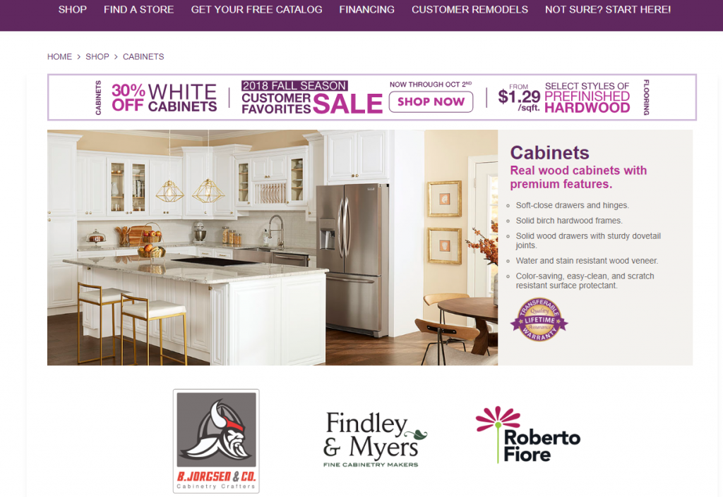
With so many different websites to compare to one another and navigate through, our goal is to ease the burden on you in a process that is already filled with stress and challenges. One website that caused us stress to even attempt to navigate through was that of Cabinets To Go. Abrasive colors, large text, and an onslaught of information through various fonts and colors created a chaotic website design that did not lend itself to easy navigability. The drop-down menus were readily available, but even the information offered in the menus themselves was unclear in where exactly to find a specific line of a certain style of cabinet. Rather than offering a single link to a page displaying the various cabinet lines that is easily discovered and accessible, Cabinets To Go somewhat guides you through a maze of different pages until you are finally led to a messy page that is an amalgamation of advertisements for cabinet brands, ongoing sales, and no real organized list with pictures and prices to assist in selecting what line will work best in your kitchen. Of all the websites discussed in this comparison, we rank Cabinets To Go at the bottom for the lack of accessible navigability and options, adding stress to the process of a kitchen remodel on the part of the prospective consumer.
Design, Aesthetic, and Navigability are the foundations of what constitutes a quality website: what appears on your screen as you shop through the available options offered by a distributor will determine whether or not you spend your hard-earned money on the cabinets offered by a said website. In discussing navigability, we have been able to see exactly how the design and organization affect the overall aesthetic of a website and in turn, determine the experience of the consumer as he or she makes a selection out of the available units and styles depending on price and color. Less visible and concrete than these aspects of a website, but no less important, is the online customer support and service offered by a cabinet company’s website.
Customer Support and Service
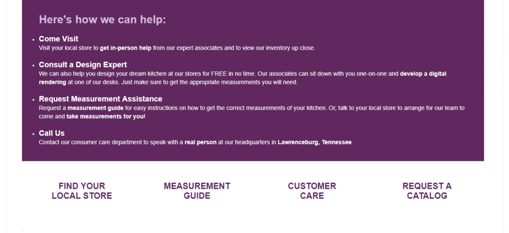
Earlier we relayed a metaphor comparing the negative experience one might encounter while navigating through a website with poor design and layout akin to wandering through a Home Depot without any employees visible to guide in the search for a single screw. In the event a website either offers little or no customer support, the stress this incurs is doubled when also fighting a poor website design. Of the five websites discussed in this comparison, they offered a wide range of customer service experiences ranging from remarkable to nonexistent. In an attempt to alleviate your own stress, we will start with which customer service experience left us at a loss and frustrated to the extent of having virtually nobody to contact as we struggled to find our way through the website.
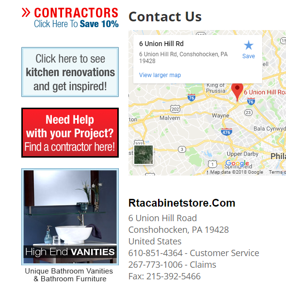
As you might have guessed it, Cabinets To Go had us spending more time than we really cared either waiting for their pages to load, looking for a phone number to call with our issues, or even finding where their listings of cabinet lines and styles were available to be seen on their website. More than once their website froze on us as we were attempting to shop around, something which has not happened on any other website which we have come across. Testimonials are available to be seen on the website itself, but naturally, each of them relays a satisfied customer experience with the product and services offered by Cabinets To Go. Nowhere on their home landing page or customer service pages do they advertise what their grades or ratings are with BBB or Houzz, as other websites are wont to do and let the reviews speak for themselves rather than advertising customer testimonials. Mainly because of the way the website is laid out and speaks to the customer, we get the overwhelming impression that Cabinets To Go is intended to be a business one visits in person rather than an online presence competing with the likes of Best Online Cabinets and The RTA Cabinet Store. At any rate, with no Live Chat available and a slow response to both emails and voice messages, Cabinets To Go pales in Customer Service and Support when juxtaposed with the likes of Kitchen Cabinet Kings and RTA Cabinet Store.
RTA Cabinet Store offers a variety of tools that allow the consumer to educate him or herself in how to design a kitchen layout, as well as the ability to search for a local contractor who has worked with the company in the past. As to be expected, one must register with an email address in order to acquire these services, but the benefits of doing so will relieve a sufficient burden of stress in this process on your part as a consumer. If it is in your budget, we highly suggest utilizing these services and finding a contractor who knows the product offered by RTA Cabinet Store and will find an appropriate cabinet line that will best suit your personal taste in aesthetic, style, quality, and price. While this is a major positive characteristic, it is also pretty standard for websites to offer these services; regardless, it is a huge step above what is offered (or rather, not offered) by Cabinets To Go.
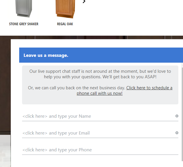
No Live Chat options are visible or readily available through RTA Cabinet Store’s website, but they do have several alternative options in place of this readily available customer support formatting. You can choose to leave a message, with the assumption they will return your contact in a reasonable amount of time (and they do that, as we left a message concerning the quality of certain hinges and they responded within several hours, during regular business hours of course). If you were to leave them a message outside of regular business hours it is hard to say the amount of time it would take for them to return your message, but if the response time to our message is any indicator it is safe to assume they will be punctual in their response. The other option is to leave your phone number and email, and they will give you a call when their next customer service representative is avialable. We did not experiment wth this option, mainly because we did not care to be put on hold as we assume the majority of other customers will avoid. In any case, the mere presence of these options immediately makes a better case for RTA cabinet Store than that of Cabinets To Go.
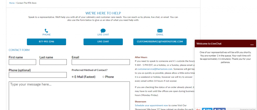
All three of the other cabinet websites offer the Live Chat option as a part of their Customer Service and Support system. This feature is endlessly helpful for those with little or no experience in renovating a significant portion of their home. The task is daunting, to say the least, and to have a relatable person on the other end of a chat window assisting you in this process cannot be understated. Our Live Chat experiences with all three tell various stories of the quality of Customer Service offered by each website, and in our opinion, each is with its benefits. When seeking help through the RTA Store’s easily navigable website, we entered the Live Chat window and were put in the queue behind several other customers. The wait time was 11 minutes Which gave us plenty of time to play around with the filtered search options and peruse through the online database of cabinet lines. Their representative responded before the 11 minutes was up and very kindly offered suggestions for kitchen renovation ideas and referred us to the Free Room Design service offered by The RTA Store. Again, this service requires the input of some personal information but will pay itself off in dividends for the assistance you will receive (not to mention, it is free). Overall, shopping through their website is a pleasant experience and the Customer Service plays a major role in alleviating the stress of completing this step in the kitchen renovation process.
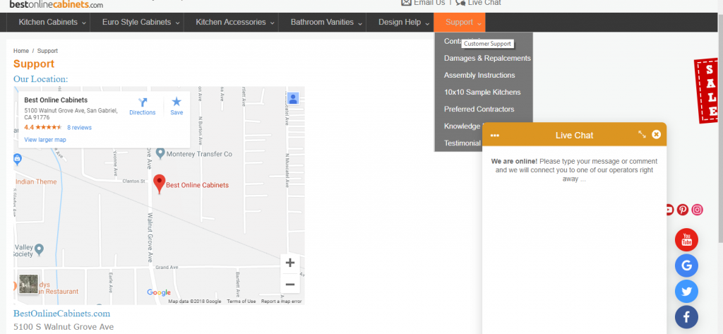
Best Online Cabinets has a slightly different approach to their Live Chat option: rather than set you in a queue to wait around until the next available Customer Service representative contacts you, they allow you to be the first to reach out and contact the representative, who responds almost immediately once you make the initial contact. Their team is friendly, knowledgeable, and happy to assist in the kitchen design through online correspondence or through an in-house consultation at their showroom offices, made by appointment. They are happy to send sample doors out to you of different styles so you can get a feel for the style, color, and quality of a specific cabinet line. Their drop-down menu alone under the “Support” tab covers more ground and information than almost every other website combined. Truly, if you are interested in educating yourself on Ready-to-Assemble cabinets, BOC’s online Support database will provide you with a dearth of material and information.
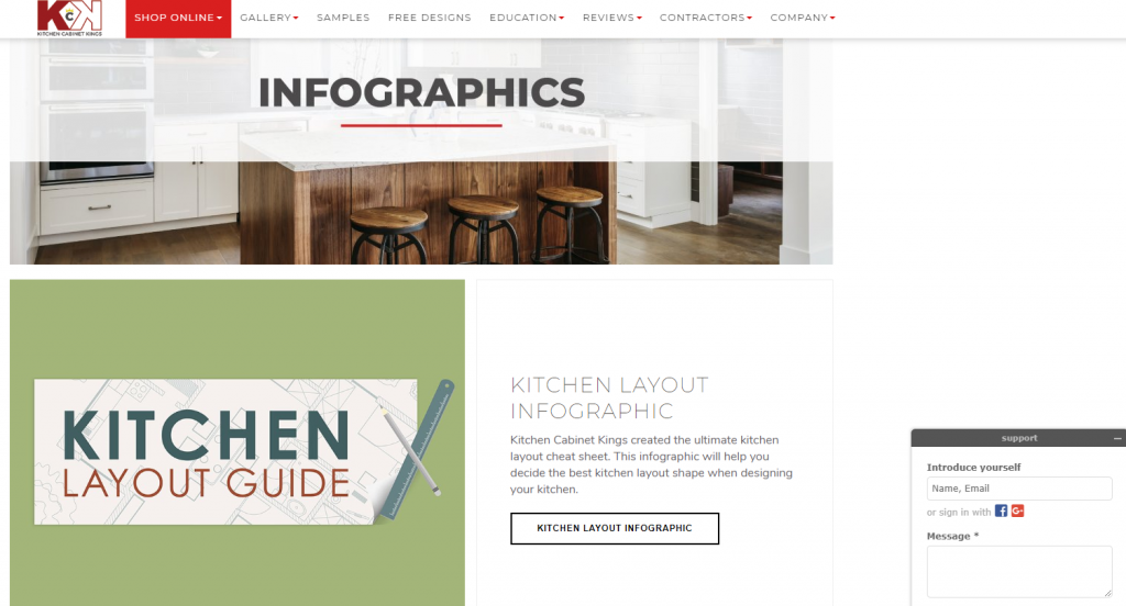
Kitchen Cabinet Kings by and far outshines the other four websites in terms of customer service, free kitchen design, Live Chat/email/phone call availability, and professional courtesy in their willingness to assist in completing the process of the kitchen or home renovation. Within minutes of arriving on their web page, a customer service representative had opened a Live Chat window and was asking how he could assist us in the process. Very few websites, in general, offer this service, and it makes a prospective client feel look after, attended to, and ready to explore options. In addition to Kitchen Cabinet Kings’ website having a crisp, sleek, and professional design, it is rife with information including kitchen layout templates; a glossary of terms and phrases for different models, styles, cabinet parts, etc.; articles on various individuals experiences in their own kitchen remodeling process; and a host of other useful links including tools, videos, blogs, and infographics. Each of these links leads to a page that expertly maintains the consistency of the previous page so you know you havent been led to another website or blog, and the entire time the Customer Service representative is available and willing to assist during office hours. After spending some time reading through these articles and exploring the website of Kitchen cabinet Kings, we faced an even bigger challenge in deciding which website was the overall best for shopping for RTA cabinets.
Kitchen Cabinet Kings undoubtedly takes the top position among the five websites as far as customer service goes. With a team ready and willing to message you from the outset as soon as you land on their page, it is no wonder they have been featured in numerous television shows on HGTV and espouse their online ratings at the top of each page you land on their website. Be ready to be helped if you choose Kitchen Cabinet Kings as your online RTA cabinet distributor.
Conclusion
While each of these websites does bring something positive to the table (or rather, the screen), the competition really boils down to a contest between two websites: The RTA Store and Kitchen cabinet Kings. In choosing which website we believe to be the superior, we took into account each of the preceding sections and pitted the websites against one another. The result we came to are undoubtedly interesting:
- Both have professional, expertly designed website layouts with sleek fonts, appropriate color schemes, and an accessible amount of information to digest upon initial landing on the main page.
- The RTA Store by and far has the easiest website through which to navigate: a comprehensive filtered search menu, simple website design, and information being readily available through concise explanations and easy click-and-go formatting.
- Kitchen Cabinet Kings provides a huge amount of relatable, well-written and organized information on their website as well as a customer service/support team that doesn’t hesitate to reach out to offer advice and suggestions in the remodel process.
When all is said and done, our vote goes with Kitchen Cabinet Kings for having the highest quality website of the five websites we have explored and shopped upon thus far. This took us slightly by surprise, as the units we built from their inventory did not stand out to us so much as some of the units from Best Online Cabinets or RTA Cabinet Store. Regardless, we noted at the beginning of this comparison that a website is not necessarily a direct representation of the quality of the products carried by a certain distributor. Kitchen Cabinet Kings certainly presents itself online as a company for royalty, and their Customer Service team treats you, the prospective client, as such. At the end of the day, the products speak for themselves, just as the cabinets you choose will speak for your kitchen and your home. Don’t hesitate to reach out for help in the process from any of the great companies on their websites discussed in this comparison, and good luck with your projects!

